Microsoft Chief Product Officer at Microsoft for Windows and Devices Panos Panay posted a teaser video on Instagram showcasing Windows 10’s new design.
The video Panay shared on Instagram was made to commemorate Windows reaching a 1 billion milestone and it briefly chronicles the evolution of the Windows logo through the years.
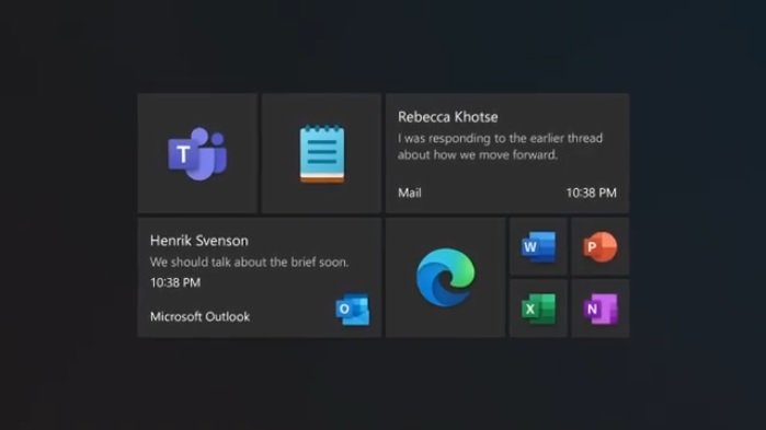
Microsoft has mostly talked about the new icons and its Fluent design language.
The biggest and most prominent change has to do not just with the icons but the way they are presented in the Start Menu.
Based on teaser video, the new UI design strays away from the blocky background on the icons on the start menu.
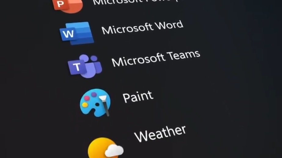
Colors have shifted away from the tile background to the icons themselves, leaving the tiles more like translucent glass between the icon and the Start Menu’s surface.
Cursor customizability, giving them a slider to adjust cursor height and a wide array of colors to choose from.

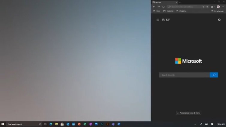
New Windows 10 redesign now allows even more choices for Windows snapping, aside from the traditional split-screen effect.
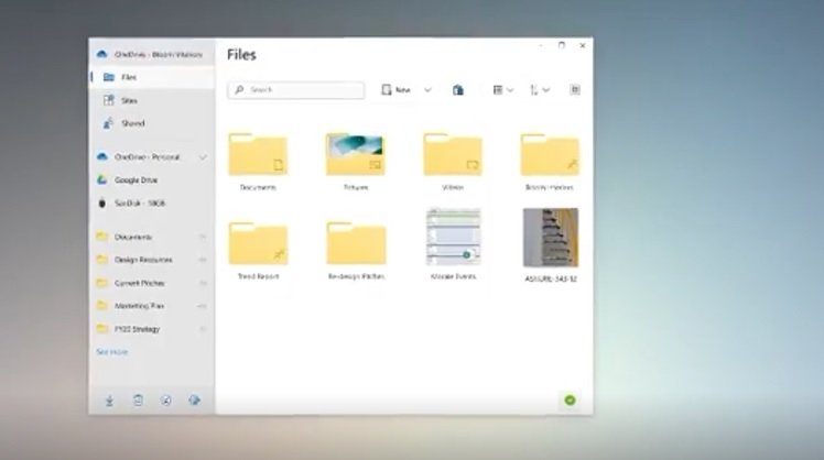
File Explorer and Calendar apps get their new, clean look while the right-click context menu has apparently acquired a Back action. The items on the taskbar are also getting both a visual change and a cleanup while keeping much of the functionality the same.
Here is the teaser video, you may watch below:
You may share your comment below. For more update Join us on @Facebook.

